*{
box-sizing:border-box;
}
https://www.w3schools.com/css/css3_box-sizing.asp
By default, the width and height of an element is calculated like this:
width + padding + border = actual width of an element
height + padding + border = actual height of an element
The box-sizing property allows us to include the padding and border in an element’s total width and height.
If you set box-sizing: border-box; on an element padding and border are included in the width and height:
我們必須在網頁裡
面加入viewport 的設定來設定行動裝置顯示網頁的方式
| 1 |
width |
寬& device‐width |
設定畫面寬度 |
| 2 |
height |
高 & device‐ height |
設定畫面高度 |
| 3 |
initial‐scale |
最小0.25,最大5 |
設定畫面的初始縮放比例 |
| 4 |
minimum‐scale |
最小0.25,最大5 |
設定畫面的最小縮放比例 |
| 5 |
maximum‐scale |
最小0.25,最大5 |
設定畫面的最大縮放比例 |
| 6 |
user‐scalable |
1 or 0 (yes or no) |
設定是否允許使用者改變縮放比例 |
| 7 |
shrink‐to‐fit |
yes or no |
設定ios 是否放大縮小(只有ios 有) |
-
–webkit-text-size-adjust: none;
/* 在 iOS 旋轉手機畫面時鎖定文字不縮放 */
–webkit-text-size-adjust: none;
-
用百分比%的方式來調整各個元素的寬高,並且利用圖片來撐高父物件的高度
header{
width:100%
height:auto;
overflow:hidden; [備註一]
}
header > img{
width:50%;
height:auto; /*Default, can skip*/
margin:0 auto;
}
[備註一]
RWD觀念中,不得出現橫向卷軸(left scroll)
overflow:hidden => 超出範圍的皆蓋住、隱藏
Reference – CSS overflow property
-
若僅有文字的話,用line-height來撐開元素的高度
article{
width: 100%;
height: auto;
overflow: hidden;
}
article > p {
color: #888;
font-size: 16px;
padding: 20px;
line-height: 32px; //font-size的兩倍
}
footer{
width:100%;
height:auto;
overflow:hidden;
line-height: 50px;
background-color: #008888;
text-align: center;
}
-
media-queries切換不同版本的CSS與斷點
View
1.PC (1024px以上)
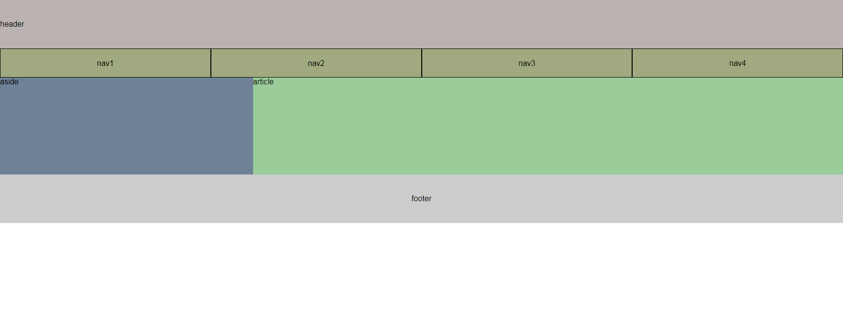
2.Pad (415~1024px)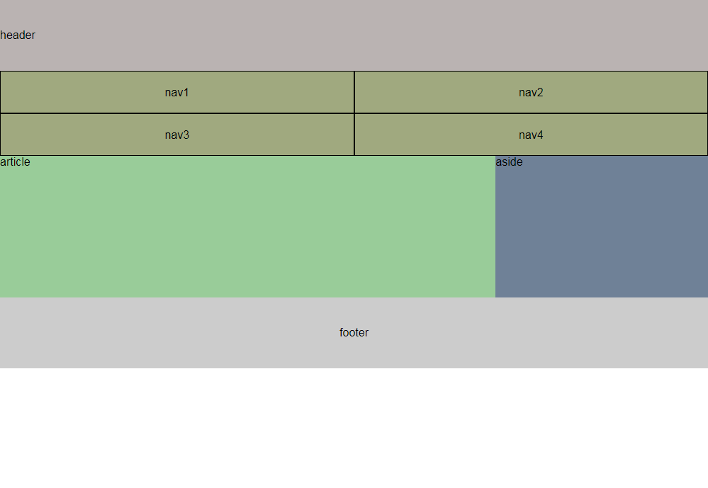
3.mobile (414px以下)
**放在同一隻css中
@import url("reset.css");
/*PC版*/
*{
box-sizing: border-box;
}
header{
width: 100%;
height: 100px;
background-color: red;
line-height: 100px;
}
nav{
width: 100%;
height: 60px;
background-color: #ccc;
}
nav > a{
display: block;
width: 25%;
height: 100%;
background-color: blue;
float: left;
text-align: center;
line-height: 60px;
border: solid 1px black;
color: black;
}
aside{
width: 30%;
height: 200px;
background-color: red;
float: left;
}
article{
width: 70%;
height: 200px;
background-color: blue;
float: left;
}
footer{
clear: both;
width: 100%;
height: 100px;
line-height: 100px;
text-align: center;
background-color: #ccc;
}
/*Pad版,CSS後者會覆蓋前者,因此僅需寫欲改變的區塊*/
@media screen and (min-width:415px) and (max-width: 1024px) {
nav{
width: 100%;
height: auto;
overflow: hidden;
background-color: #ccc;
}
nav > a{
display: block;
width: 50%;
height: 60px;
background-color: blue;
float: left;
text-align: center;
line-height: 60px;
border: solid 1px black;
color: black;
}
aside{
width: 30%;
height: 200px;
background-color: red;
float: right;
}
article{
width: 70%;
height: 200px;
background-color: blue;
float: left;
}
}
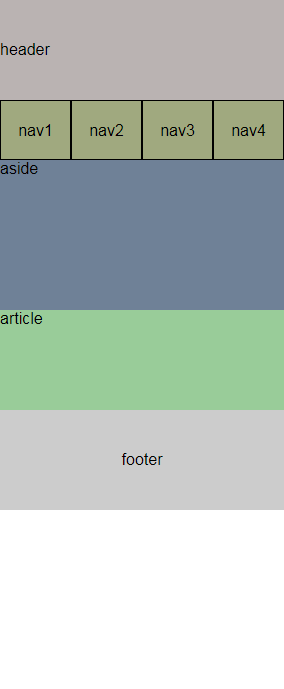
/*Mobile版*/
@media screen and (max-width:414px) {
aside{
width: 100%;
height: 150px;
background-color: red;
float:none;
}
article{
width: 100%;
height: 100px;
background-color: blue;
float:none;
}
}

 跟著節奏搖擺的工程師